Need help setting up your files for printing?
Browse our preparation guide to avoid delays in production due to file issues.
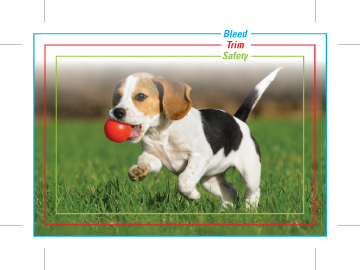
The area beyond the trim edge of your page document is considered the bleed area.
When a colour or image touches the edge of your page, it’s required that the colour or image bleed 1/8” beyond the edge to to account for movement of the paper and design inconsistencies. This will prevent any white border from showing when the document is trimmed.
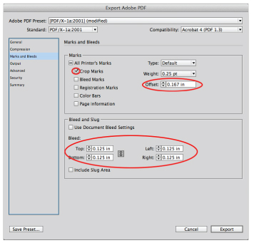
For the bleed to show up in your PDF, you must indicate 1/8” bleed in your PDF print or export setup.
The trim area indicates the finished size of the document.
Files should include trim marks set back 0.167” from the edge of the document. Do not manually draw in the trim marks. Allow the software to add the trim marks when you create your PDF.

You must indicate that you want trim marks in your PDF print or export setup for them to show up.

Remember to keep important information, like names, addresses, phone numbers or logos, within the safe area (at least 1/8” – 1/4” from the edge) to ensure that they aren’t cut off when your document is trimmed.

CMYK (cyan, magenta, yellow, black) are the ink colours used in the printing process, whereas RGB (red, green, blue) are the colours used by screen displays such as your monitor.
Your document should be created in CMYK mode so that the colours you see on the screen most closely match the final printed product.
Many of the bright values produced by our monitor’s RGB displays cannot be reproduced in print.

Process and Pantone (spot) colours may look identical on screen, but they will separate differently.
If you need to convert a spot colour to CMYK process, please use a conversion guide or ask us for a recommendation.

When your project has heavy, solid black ink coverage please convert to rich black.
For best registration on press, do not use rich black on fonts. The rich black combination we prefer is C40, M0, Y0, K100.

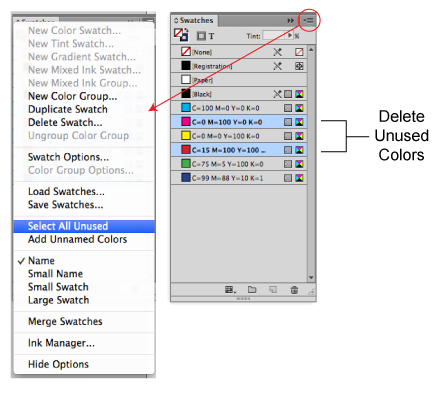
Delete unused colours from your swatch palette before submitting your file.
If the piece is printing entirely in CMYK, convert any spot colours you may have used. This eliminates any question as to whether you want the piece printed as CMYK or spot.
Best practice is to indicate ink specifications when you supply your file, especially if you want it to print with a combination of CMYK and spot.
Reversed type should be no less than 6 pt, and if possible, sans-serif (i.e. Helvetica or Arial) and bolded.
Fine lettering (thin lines, serifs) should be restricted to one colour for best registration. Small black type should be 100% black rather than rich black for best registration.
For digital art files not supplied the same dimensions as they will be printed, the effect of scaling reduction should be considered for small text and for thin rules or lines.
All lines and line art images should be a minimum 0.5 pt thickness (including reversed lines/line art) at final size to reproduce effectively on press.
All fonts and graphics must be included with your files. Take advantage of the “Collect For Output” feature in QuarkXpress, or the “Package” feature in InDesign. It will help you collect all the fonts and images used, and search for missing items. Your document may show the placed image, but the actual file may have become unlinked when saved in a folder that differs from its original location. Missing links can cause graphics to print out pixelated or not at all.
Please remove any unnecessary or non-printing elements from your document or pasteboard.
If working in Adobe Illustrator, graphics should be embedded within the file, and fonts should be converted to paths. If you do not convert your fonts, be sure to include them with your document when you upload your files.
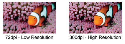
Images must conform to the specifications for minimum image resolution – 300 dpi for offset printing and 150 dpi for digital printing. Photoshop provides tremendous pixel control; however, raster software cannot enlarge images without a loss in quality.
It’s better to start out big when producing a digital image, as you can scale down with impunity.
If you need to make an image larger, it is best to rescan or reshoot it at a higher resolution. Vector graphics, however, retain high image quality at any size.
Placed images should not be scaled, cropped/masked or rotated within the page layout application. Instead they should be manipulated in a proper image editing program (e.g. Photoshop) and then imported into the page layout program at proper size and position.
If done in a page layout program, these steps consume a lot of computer memory.
Try to flatten all transparency effects (soft drop shadows, etc.) to eliminate possible ripping/printing issues.
Most transparency issues can be resolved before saving your file for print.
